Lesson 3: Timers and triggers

About this lesson
This is the third in a series of lessons to incorporate graphical user interfaces (GUIs) into your general-purpose programming. The series follows on from the Visual To Text Coding lesson series.
Year band: 7-8
Curriculum Links AssessmentCurriculum Links
Links with Digital Technologies Curriculum Area
| Strand | Year | Content Description |
|---|---|---|
| Processes and Production Skills | 7-8 |
Design the user experience of a digital system (AC9TDI8P07) Generate, modify, communicate and evaluate alternative designs (AC9TDI8P08) Design algorithms involving nested control structures and represent them using flowcharts and pseudocode (AC9TDI8P05) Trace algorithms to predict output for a given input and to identify errors (AC9TDI8P06) Implement, modify and debug programs involving control structures and functions in a general-purpose programming language (AC9TDI8P09) |
Assessment
Students undertake a self-reflection of the programming task. The teacher can use the completed self-assessments to assist in summative assessment.
In assessing code in languages like Python or JavaScript, consider a rubric that includes important skills for general-purpose programming.
Learning hook
Using screenshots or the real thing, demonstrate with the class the interfaces for two different modes of interaction:
- a webpage on a desktop or laptop browser (eg. youtube.com)
- the equivalent app for phone or tablet
Discuss as a class the differences and similarities in terms of:
- amount of information displayed
- number of interactive elements (buttons, etc.)
- size of interactive elements, including relative size of elements within each interface
List some other things you think UI developers might need to consider when creating an interface for touchscreen devices like phones.
With their smaller screen size and touch interaction, devices like phones are often used more casually and spontaneously than desktop or laptop computers.
Websites or apps made for touchscreen devices like phones typically:
- present less information at once than the equivalent desktop webpage, focusing on the basics rather than details,
- have fewer and less diverse interactive elements,
- size the interactive elements for a finger to be able to tap, rather than a mouse click.
Many of our accepted names for interface elements came about as real-world metaphors or analogies. For example, the different directories where we place computer files became known as folders as part of a 'file cabinet' metaphor, as physical documents in a traditional office were placed in physical folders before they were stored.
Assign the following to student pairs or teams. They should research to give a short explanation to the class of the origin of the metaphor and when it was first used:
- the recycle bin
- the floppy disk save icon
- opening and closing windows
- the desktop
- cut and paste
- the use of the word icon
- the hamburger button for menus (not strictly a metaphor)
- the cloud
- browser bookmarks
The activities above touch on the second of four principles for good user interface design, ‘Make it comfortable for a user to interact with a product’, distilled from this article hosted by Adobe. A GUI should be:
- free of unnecessary elements and jargon words (use real-world metaphors when necessary)
- accessible (appropriately considering users’ visual, hearing, cognitive and motor skills)
- responsible regarding protection of the user's work (avoid making the user repeat or redo work)
- good at handling unexpected errors (giving the user useful information).
Learning map and outcomes
In this lesson, students will:
- access an online programming environment for JavaScript alongside HTML and CSS
- create an accurate digital clock
- revisit the classic higher or lower game with a full GUI
- take on a fresh coding challenge to make a fast-clicking game.
Learning input
This video introduces the first application for this lesson.
setTimeout(updateClock, 1000);
This creates a simple stopwatch to call the function updateClock() exactly 1 second from now. Because the line is put in before the end of the function itself, the 1-second stopwatch is re-created every time the function runs. This means the function keeps being called every second.
Learning construction
Step 1: Setup
In this course, different environments will be selected based on their suitability for each demonstrated project.
For more on the set-up and environments used, see Lesson 1.
Step 2: Constructing the digital clock
This video builds the digital clock application from the ground up.
Try it yourself before checking the solution code.
Solution Code
Step 3: Tinkering with the clock
By editing the CSS and JavaScript, make the following adjustments to the clock application:
- Change the display colour to a light blue instead of red.
- As well as hours and minutes, have the clock display seconds.
- Adapt or duplicate the existing function that formats the minutes to have a 0 at the front. The new function should do the same for the seconds.
Solution Code
Step 4: Second application - higher or lower game
The video below demonstrates how the higher or lower game with a GUI. (This game was also featured in the original course without a GUI.)
Try it yourself before checking the solution code.
Solution Code
Step 5: Tinkering with the game
By editing the CSS and JavaScript, make the following adjustments to the game:
- Change the game so the player must guess a number between 1 and 50.
- Make the confirm button orange instead of blue.
- Give the game a time limit of 20 seconds from when the program first starts. Once the 20 seconds runs out, it should display GAME OVER and then reset the game, regardless of what the player has done so far.
Note: You do not need to show the countdown.
Solution Code
Challenge
These challenges use the skills covered so far. By writing or modifying their own programs, students have an opportunity to demonstrate Application and Creation.
Challenge 1
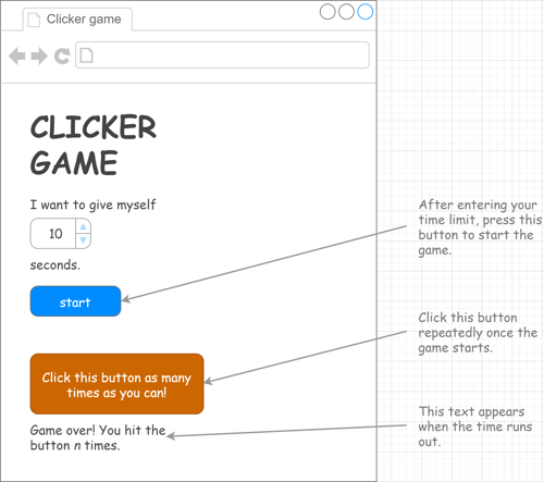
Now that you can set functions to run after a specific time runs out, your challenge is to make a simple clicker game that counts the number of times a button is pressed within a time.
Below is an annotated mock-up for the application's interface, created at diagrams.net.

You can improve the game by
- requiring the user to hit one of four buttons, changing every time,
- showing the countdown onscreen.
Challenge 2
Solution Code
This second challenge is a little different. Your job is to finish an unfinished project for a stopwatch.
To finish the stopwatch, follow these steps:
- Open the project at repl.it (Lesson-3-Challenge-2-STARTER), or at JSFiddle (4eds5v60).
- Read through the code carefully, especially the HTML and JavaScript. By testing, trace what happens when each button is pressed.
- Add code to the updateTime() function so that minutes increases by 1 when seconds reaches 60.
- Add a reset() function so that the minutes and seconds go back to 0 when the RESET button is pressed.
- Change the presentation of the seconds so that it is always shown in two digits, ie. 00, 01, 02, 03, 04, 05, 06, 07, 08, 09, 10, 11...
- Improve the main display text so that it has a more modern font.
- Improve the look of the buttons, so that they are more modern and attractive.
- Add milliseconds to the display.
Resources
- Online environments for creating webpages with HTML, CSS and JavaScript:
- JSFiddle – simple interface that hides linking HTML code, also used in Visual To Text Coding lesson series
- repl.it – shows complete HTML to reflect offline approach, and allows uploading of images and other files for use in webpages
- Introductory courses
- HTML tutorial – An introduction to HTML
- CSS tutorial – An introduction to CSS
- Visual To Text Coding lesson series – The predecessor to this learning sequence introduces JavaScript as well as Python.
- JavaScript CheatSheet (Tip: Press the little blue tabs to move Variables, Basics, Strings and Data Types to the top.)
 Image: