Lesson 5: GUIfy my program!

About this lesson
This is the fifth in a series of lessons to incorporate Graphical User Interfaces (GUIs) into your General Purpose Programming. The series follows on from the Visual To Text Coding lesson series.
Year band: 7-8
Curriculum Links AssessmentCurriculum Links
Links with Digital Technologies Curriculum Area
| Strand | Year | Content Description |
|---|---|---|
| Processes and Production Skills | 7-8 |
Design the user experience of a digital system (AC9TDI8P07) Generate, modify, communicate and evaluate alternative designs (AC9TDI8P08) Design algorithms involving nested control structures and represent them using flowcharts and pseudocode (AC9TDI8P05) Trace algorithms to predict output for a given input and to identify errors (AC9TDI8P06) Implement, modify and debug programs involving control structures and functions in a general-purpose programming language (AC9TDI8P09) |
Assessment
Students undertake a self-reflection of the programming task. The teacher can use the completed self-assessments to assist in summative assessment.
In assessing code in languages like Python or JavaScript, consider a rubric that includes important skills for general-purpose programming.
Learning hook
You and your friend are co-developing an application with the ability to save progress.
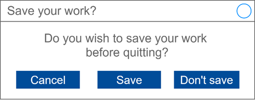
As a helpful feature, your friend proposes a pop-up for when the user tries to exit the program without saving their work:
As a class, discuss if you see any problem with the above UI design for this pop-up. For comparison, bring up a similar pop-up when exiting Microsoft Word, Notepad or another application like Audacity.
 Image credit:
ICMA Photos/ Wikimedia Commons, CC BY-SA 2.0
There is a serious problem with this design. It does not conform with user expectations for the placement of the three buttons.
The convention for pop-ups of this kind is for the Cancel button to be on the right. A user pressing the right-most button in this dialog may be expecting to return to their work without exiting, but instead they would be confirming to exit and lose their work.
The activity above touches on the last of 4 principles for good User Interface design (distilled from this article hosted by Adobe): Make user interfaces consistent. A GUI should:
- employ visual consistency (same style, fonts, colours throughout)
- functional consistency (no surprises in the way the UI behaves)
- conform with user expectations (follow conventions and avoid reinventing)
Learning map and outcomes
In this lesson, students will:
- access an online programming environment for JavaScript alongside HTML and CSS,
- upgrade a text-only heads or tails game to a full GUI with animation,
- examine two other completed GUI applications upgraded from text-only.
Learning input
The main example in this lesson is a heads or tails game.
First, review and test the text-only version of the game in JavaScript here. (The game was first introduced and built in Lesson 3 of the course previous to this one).
Next, access the starter project for the new GUI version here. It contains skeleton code that will be built on as the lesson progresses.
Finally, view the video below. It gives an overview of the whole lesson and explains the starter project.
Learning construction
Step 1: Setup
In this course, different environments will be selected based on their suitability for each demonstrated project. This lesson uses the repl.it environment exclusively.
For more on the set-up and environments used, see Lesson 1.
Step 2: Constructing the Heads Or Tails game
This game is the most complex of the GUI applications made in this course so far. Each video below tackles a part of the coding process.
First, set up the function for user button presses.
Solution Code
Next, begin the code for flipping the coin.
Solution Code
Next, flip the coin images and stop after a random number of flips.
Solution Code
Now, complete the basic game by checking if the user's guess matches the coin after it stops.
Solution Code
Step 3: Improving the Heads Or Tails Game
First, we'll add a scoring system.
Solution Code
Next, keep track of how many turns it takes the user to win.
Solution Code
Finally, improve the buttons and fonts.
Solution Code
Step 4: Two other GUI applications
Before the major project, here are two more completed GUI applications for you to look at.
Test them out first, then take the time to step through the HTML, CSS and JavaScript to see if you can follow how they work. Tinker with some of the code to change the behaviour of the programs.

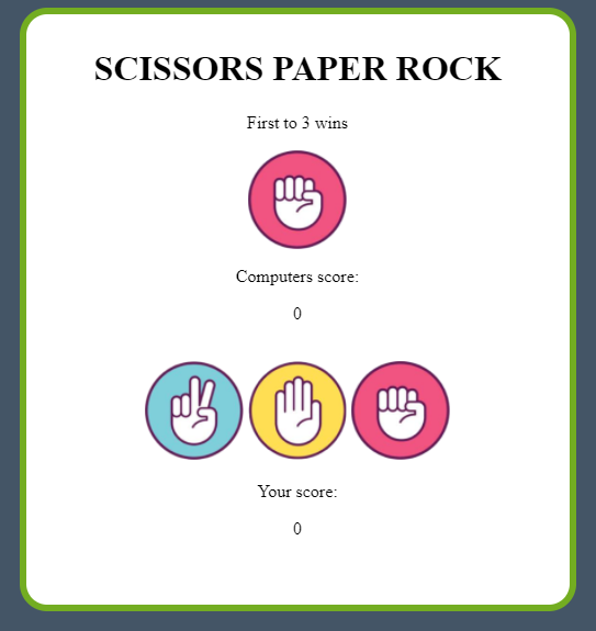
Scissors Paper Rock (original text-only program from this lesson)
View this web-based tutorial on Scissors Paper Rock. This tutorial covers the groundwork of making a function 'scissor paper rock' game with console.log output. Once you have completed this tutorial, the next one goes into more advanced features like changing scores and having a 'spinning' computer guess icon.

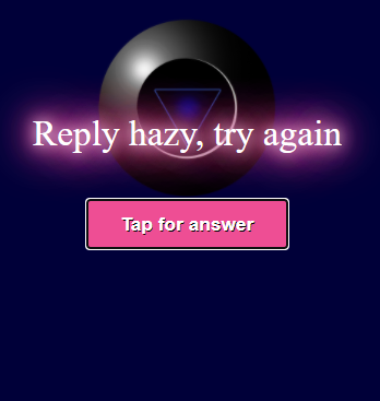
Magic 8 Ball (original text-only program from this lesson)
(Students may also wish to test an experimental mobile version of this webpage, which responds to tilting the mobile device. To do so, access this link on a mobile device. Unfortunately, repl.it does not reliably support these features at time of writing, so students cannot edit the code.)
Challenge
This lesson does not include a fresh coding challenge. Students can undertake a final project as set out on this page.
Resources
- Online environments for creating webpages with HTML, CSS and JavaScript:
- JSFiddle – simple interface that hides linking HTML code, also used in Visual To Text Coding lesson series
- repl.it – shows complete HTML to reflect offline approach, and allows uploading of images and other files for use in webpages
- Introductory courses
- HTML tutorial – An introduction to HTML
- CSS tutorial – An introduction to CSS
- Visual To Text Coding lesson series – The predecessor to this learning sequence introduces JavaScript as well as Python.
- JavaScript CheatSheet (Tip: Press the little blue tabs to move Variables, Basics, Strings and Data Types to the top.)
