Rubbish recording and reduction: Part 1
About this lesson
In this lesson sequence students survey and collect data concerning what is brought to school each day and subsequently becomes rubbish. They then use Excel to present that data in a variety of different ways.
Year band: 3-4
Curriculum Links AssessmentCurriculum Links
Links with Digital Technologies Curriculum Area
| Strand | Content Description |
|---|---|
| Knowledge and Understanding |
Recognise different types of data and explore how the same data can be represented differently depending on the purpose (AC9TDI4K03). |
| Processes and Production Skills |
Discuss how existing and student solutions satisfy the design criteria and user stories (AC9TDI4P05). Use the core features of common digital tools to create, locate and communicate content, following agreed conventions (AC9TDI4P06). Use the core features of common digital tools to share content, plan tasks, and collaborate, following agreed behaviours, supported by trusted adults (AC9TDI4P07). |
Links with other Learning Areas
| Learning Area | Strand and Content Description |
|---|---|
| Mathematics |
Statistics and ProbabilityIdentify questions or issues for categorical variables. Identify data sources and plan methods of data collection and recording (ACMSP068).
|
| Science |
Science UnderstandingNatural and processed materials have a range of physical properties that can influence their use (ACSSU074). |
Assessment
Initial discussions surrounding student understanding during the Learning hook and Learning map and outcomes phases to determine the level of student prior knowledge and understanding of the concepts covered by the learning sequence. Teachers should look for:
- Understanding of terminology associated with surveys
- Understanding of columns and rows
- Understanding of how to tally data
- Understanding of what types of rubbish there are
- Understanding of what is considered rubbish
Assessment as learning
- Monitoring of student ability to conduct a survey
- Checking of student tally sheets as they enter their data.
Assessment of learning
- Final copies of both tallies and graphs. Check these for any noticeable inconsistencies that would be indicative of either flawed data collection or flawed graph creation.
- Padlet reflections on their graphs.
Learning hook
Ask students the following:
- What kinds of rubbish are there?
How much rubbish do you think you bring in to school each week?
How much rubbish do you think you and your family produce each week?
How much rubbish do you think people produce worldwide each day?
Discuss these questions as a class. - Using an interactive whiteboard or data projector, view the video TIL: We Waste One Third of Food Worldwide.
This clip provides good stimulus material for students, encourages them to think about the amount of rubbish in the world and starts them thinking about their place in contributing to this worldwide problem.
While students are viewing the video, ask them to make notes of the things that they think are positive, negative, or interesting (Use the PMI chart or have students draw one up in their books).
After viewing the video, invite students to share their reactions with the class and encourage them to continue to complete their PMI (PMI Chart) while their peers are giving them ideas. - View the website Household Waste Statistics.
This website has a counter that is tracking the approximate amount of waste being produced globally at the moment. The information on this website is a powerful stimulus for the students.
Note: Alternatively, as a digital approach, students can use Padlet to add their views to a collaborative online space during real time. (Student registration is not necessary and you can send students a unique URL (Internet address) for your wall prepared by you beforehand.
Students participate in a whole-class discussion surrounding some of the key concepts that they will be exploring throughout this learning sequence.
Students complete a PMI while watching the clip.
Students share their ideas surrounding the topic, and continue to add to and complete their PMI.
Learning map and outcomes
- Discuss the learning intention of this learning sequence: To collect a range of data concerning the rubbish production of the school and represent these findings digitally using Excel
Ask the students what they think this is asking them to do?
What will they need to know?
What skills will they need to achieve this? - Break down the content descriptions and the key terms associated with the learning sequence with the students.
Data – any information that is collected or researched. This can be numbers or words.
Survey – a means of collecting information about the frequency of something occurring
Tally – a means by which to record the frequency of an occurrence, often used when conducting a surveyStudents respond to questions concerning the learning intentions for this lesson and develop a deeper understanding of what they are learning about and why.
Learning input
- Place the students in groups of three. Explain to the students that they are now going to collect some data on what types of rubbish each student in their school has brought in for their lunch. (Classes surveyed will vary depending on the school context.)
Explain that each student in the group will be responsible for collecting a different set of data. They will need to find out the following:
- Student one: How much of each rubbish type is being brought into the school?
- Student two: How much rubbish in total is being brought in by each class?
- Student three: How many students in each class are bringing in no rubbish, two or fewer pieces of rubbish, or three or more pieces of rubbish?
Discuss with the students how they will need to record their findings.
What might they need to take into consideration to ensure that they are getting the information they need to answer their questions?
How would they set this out? - Discuss different means of tallying data at this point.
Student one: will need columns representing each type of rubbish that has been previously discussed.
Student two: will need to have their tally separated by classes.
Student three: will need to have their tally separated by classes with columns for each amount of rubbish for the students. - Discuss the different ways their data could then be represented as a graph. Students will need to be familiar with these terms:
Graph –a means of visually depicting data or information to make it easier to interpret. There are a range of different graphs.
Bar graph – a bar graph is one that represents data as ‘bars’ that correspond to the type of data, and the length of that bar extends to the amount of that data type there was.
Pie chart (graph) – a pie chart, or graph, represents the fraction that each form of data takes up from the whole.Note: Depending on how long it takes you to get through the initial discussion, you can decide whether you want to have the students debating what types of rubbish are worth tallying up or whether you want to simply tell them the different categories of rubbish that they will be looking for. The main categories to consider are: metal, plastic, glass, paper, organic, and Other. (Other suggestions could include rubber, fabric and polystyrene foam. It is up to you whether you want to include these or not).
Students are placed in groups of three.
Students are assigned different roles within the group.
Students participate in a discussion about how they will record their findings. They each prepare a tally in their books before they leave the classroom.
- Each student will have a slightly different version of this tally depending on the job that they have been assigned.
- Students ask any questions that they may have so far that need clarification (For example: What is a column?).
Students potentially discuss the possible rubbish types to be recorded in the tally.
Learning construction
For a list of Key terms and Excel vocabulary download this PDF.
- Send the students off with their groups to tally up the rubbish from other grades.
To speed up the surveying and to minimise disruption you could allocate each group a specific grade to survey and then collate the data at the end.
It is a good idea is to provide every student with a stopwatch and a time limit. Have them all set the stop watch to 15 minutes before they leave ( or longer if they are doing the whole school), and explain that they need to return before the timer runs out. This will help to ensure that you do not wind up with one or two groups that take substantially longer than the others. - Once the students have returned with their findings, explain that they are going to enter this data into an Excel spreadsheet. This will allow them to represent the data in a variety of different ways.
- Model how to enter data into an Excel spreadsheet using an interactive whiteboard, projector or a TV.
The data entry should be relatively basic: each spreadsheet should resemble essentially a table. (A Sample Workbook provided if needed for reference.) - Explain to them that the data that they will be entering will more or less mirror exactly what they had recorded originally in their tallies.
- Have students enter their data into their spreadsheets individually, making use of all the data that their group has collated. Each student in the group will then have three sets of data in their Excel workbook.
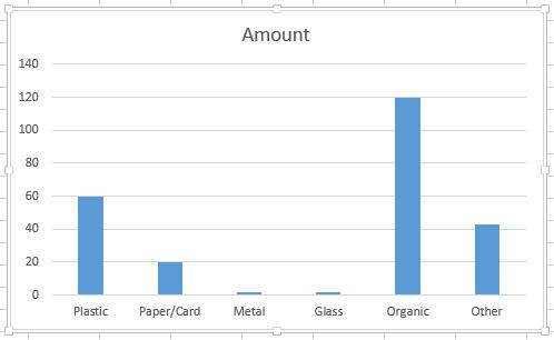
- Once the students have recorded their data they will then need to select and create an appropriate graph for each data set that they have. To assist them, display these instructions on the interactive whiteboard or television: or simply provide them to students in print form.
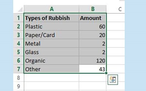
- Enter data into the appropriate cells on your spreadsheet
- Select and drag a box to highlight the data you want in your graph
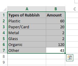
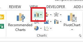
- Select the bar chart button up the top in the bar under the "Insert" tab
- Select the graph you want from the drop down menu
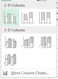
- You are now done! Your graph will appear on the screen
Extension:
Fast finishers can experiment by using the same method to then explore different ways to format other aspects of the graph (eg backgrounds, text, data).
Students move around the school with their group surveying the classes assigned to them.
Students use stopwatches or timers to assist them to be on time with their work. (It may need to be clarified with some students that they still need to complete their survey even if it means that they take a little longer than the timer. The timer is there to keep them on track, not limit their work).
Students return with their data and watch teacher model how to enter the data into Excel. They ask any relevant questions that they might have in order to clarify their understanding.
Students enter their group's data into their own spreadsheets. They will need three separate pages to do this, one for each set of data. Students select an appropriate graph for each of their data sets and create it.
Students refer to instructions to guide them through the process.
Learning demo
In this section you will demonstrate to the students how to save their graphs as an image. This is a multi-step process and during it you will teach the students about copying, pasting and the different functions of the copy command. Most students will be familiar with these terms, but it is worth a quick recap to ensure student understanding of the terms used.
- Explain that 'copying' is when you create a duplicate of a section of digital work, whether it is text, an image, a graph, or numerical data.
- 'Pasting' is when you decide you want to place your copy somewhere in a new place.
Explain the following process to students.
- First right-click on your graph and select' copy'. Next, open up a Word document.
- Right-click in the empty space in the Word document, then go to the icon on the far right of the paste commands. This is 'Paste as picture'.
Explain to the students that there are a range of different ways that you can copy and paste items. The one we are using is 'Paste as picture' because we need the graph to be an image file. - Right-click on the graph in the Word document and go to 'Save as picture', this will save the image as a picture file somewhere on your computer.
Once students have their graph saved as an image, they will be able to use Padlet to share their images with one another. They will simply have to double click somewhere on the canvas and select the image button. Then find the image you have just saved and select it, which will display it somewhere on the Padlet.
Note: Be aware that while students do not require a login in for Padlet, this can lead to anonymous posts. This may not be desirable, as it leaves no easy way to monitor students who write or post inappropriately. Students without accounts can still enter their name as their user. It is recommended that this is enforced to reduce any behaviour based issues.Students learn how to save their graphs as an image. They re-familiarise themselves with the terms 'copy' and 'paste'.
Students follow the instructions to learn how to convert an Excel graph into an image.
Students use Padlet to upload and share their graphs with one another.
Learning reflection
Ask the students if they notice any differences between their own graphs and the ones that their peers have made.
They can share these reflections on the Padlet in much the same way that they have shared their graphs.
Students explore each other's graphs and reflect on any differences or similarities that they can find between them. They share these reflections on Padlet alongside the graphs.